Taiwan Gender Equality Week
TGEW (Taiwan Gender Equality Week) is a brand committed to promoting Taiwan's gender equality issues internationally. It was established by the Ministry of Foreign Affairs and the Foundation for Women's Rights Promotion and Development, with assistance from me, in building the brand and its visual identity system. The Taiwan Mission in New York organised the "Taiwan Gender Equality Week" series of events in response to the 64th session of the Commission on the Status of Women (CSW64) scheduled by UN Women from the 9th to the 20th of that year in New York. This initiative aligns with the promotion of feminist diplomacy and continues to provide gender equality information about Taiwan on Facebook and Twitter, enhancing international understanding of Taiwan's achievements in gender equality.
TGEW(Taiwan Gender Equality Week)臺灣性別平等週,是一個致力於國際推廣台灣性別平等議題的品牌,由外交部與婦女權益基金會創立,並由我協助建構品牌及其視覺識別系統設計。台灣駐紐約辦事處舉辦「台灣性別平等週」系列活動,為響應聯合國婦女署原訂在9日至20日在紐約召開的第64屆婦女地位委員會大會,呼應推動女力外交,同時持續在臉書及推特提供我國性平資訊,增進國際社會對台灣性平成就的瞭解。
TGEW Brand Identity System Design: Design Concept
The logo consists of a lettermark (left) and a logotype (right), with the visual focus on the four letters T.G.E.W. When read from top to bottom or left to right, it can be interpreted as T.W.G.E, representing "Taiwan Gender Equality." The T.G.E.W. letters are derived from the brand name initials, aiming to simplify the complexity of the design and visual information, leaving a lasting impression through repeated exposure. Its minimalist form allows for adaptability in various usage scenarios and sizes. The logotype on the right showcases the complete meaning of each letter.
The background colour block and mountain landscape behind "Taiwan" are used for emphasis, and upon closer inspection, the end of the mountain ridge forms the silhouette of a female profile. The integration of the SDG5 symbol into the logo signifies the brand's focus on gender equality issues, while various symbolic shapes are also extended for use in slogans and other design elements.
To meet different application needs, the lettermark (left) and logotype (right) can be used separately without affecting their recognition.
TGEW 視覺識別系統設計:設計理念
本 Logo 由字母標誌(左)和標準字(右)所組成,視覺重心落在 T.G.E.W. 四個字母上,若由上至下、由左至右讀可為 T.W.G.E,正好可解讀為「台灣性別平權」。
T.G.E.W 字母取自品牌名稱之字首,旨在於簡化造型的複雜度與視覺資訊量,透過反覆的曝光令觀者留下深刻印象。極簡的造型讓它能夠因應各種使用情境與尺寸。右側的標準字則是完整呈現每一個字母所代表的意義。
"Taiwan" 後方的底色框與山景用於強調,若仔細看則可發現山稜線的末端是女性的側臉剪影。將 SDG5 之符號融合至 Logo 中,以表示品牌專注於「性別平權」議題,各種的造型符號亦延伸應用於 slogan 及其它設計項目當中。
因應不同的應用需求,字母標誌(左)和標準字(右)亦可拆開使用,並不影響其識別性。
VIS視覺識別系統設計-局部規範
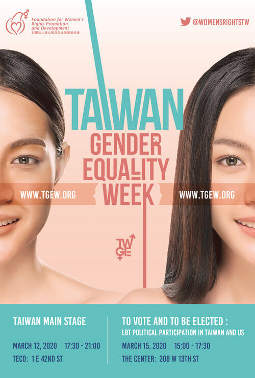
TGEW 2020 Key Visual Design
Gender is not simply black or white; it is complex and diverse. In this visual approach, we highlight the uniqueness of individuals' faces to convey the message that gender, whether female, male, non-binary, or any other, should not be subjected to labels or used as a basis for judgment.
TGEW 2020 主視覺設計
性別從來都不是非黑即白,這次的視覺以面貌為主軸,所欲傳遞的訊息是不論是女性、男性、中性、或第三性都不該被標籤化,更不該是我們被評斷的基準。
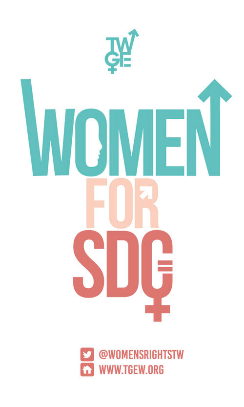
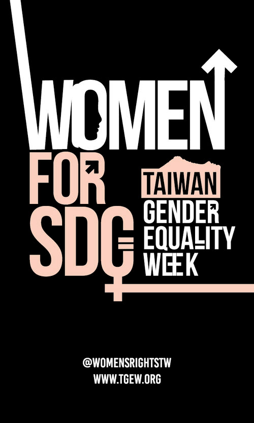
Infographic Design for Social Media
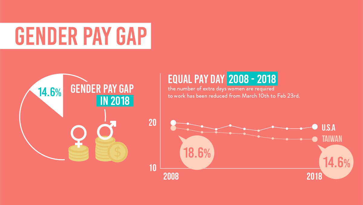
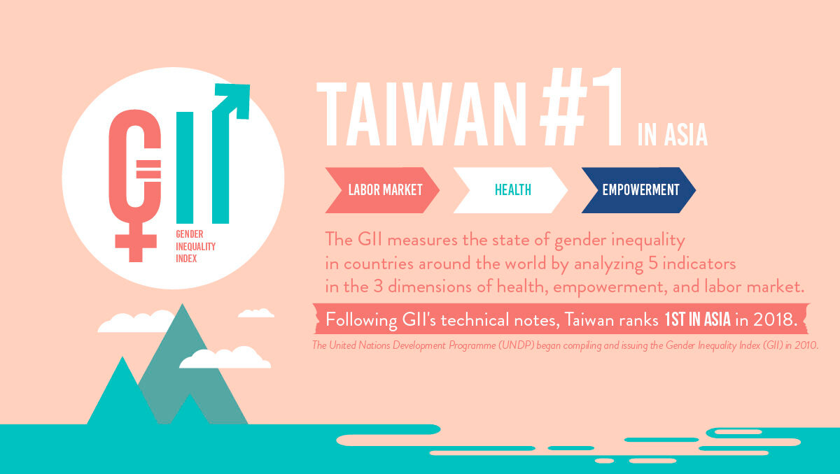
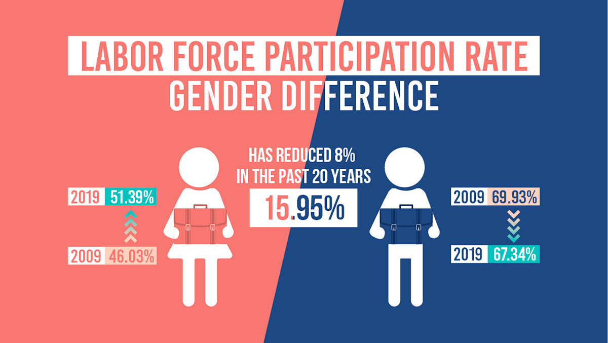
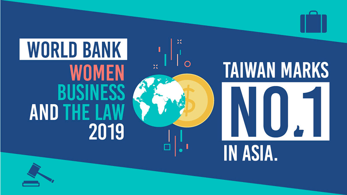
Continuing the concise, sleek, and contrasting tone of the VIS, we created visually appealing and easily understandable infographic charts for sharing on social media platforms. Additionally, we provided clients with customisable graphic templates to ensure consistency for future marketing and promotional use.
社群媒體資訊圖表
延續VIS簡明、俐落、冷暖對比的調性,我們製作了社群平台上可發文分享、吸睛好懂的資訊圖表。此外,我們也提供客戶製圖模板,以供後續行銷宣傳使用都可保有一致性。
Promotional Materials
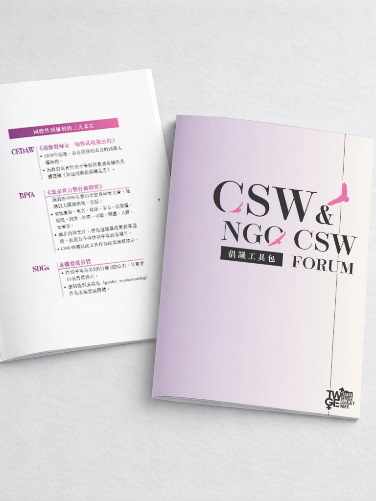
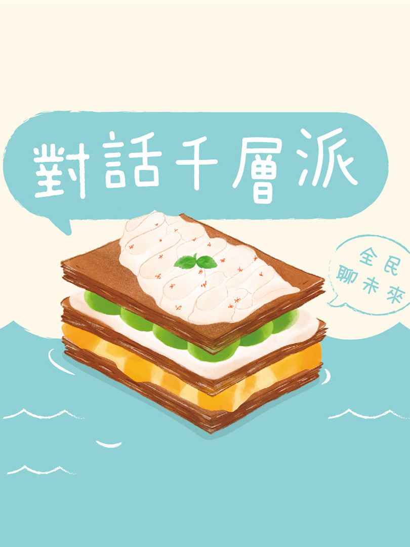
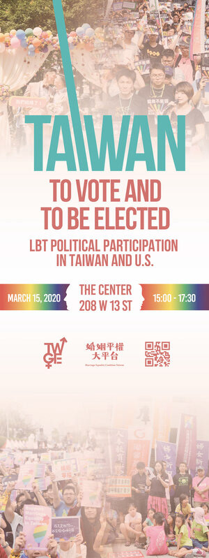
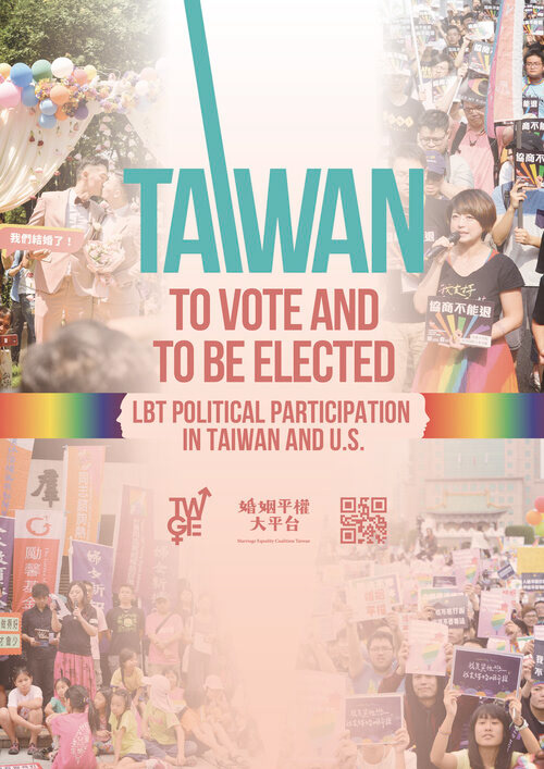
Includes cool cards, flyers, manuals used for a series of activities, gender equality week pull-up displays, bus stop advertisements, web advertisements, etc., designed according to usage context and experience.
文宣品設計
包含系列活動使用之酷卡、傳單、手冊,性平週易拉展、公車站廣告、網頁廣告用圖…….等,依據使用情境與體驗進行設計。
Environment Design
By working with suppliers in New York, we were able to produce the environment design within the Taiwan Economic & Cultural Office in New York. The designs are created in Taiwan and printed in the United States, successfully transforming the venue in New York into a visual representation of Taiwan's gender equality diplomacy. This includes bus stop advertising billboards, event backdrops, venue decorations, banners, handheld signs, and more.
場佈設計
台灣駐紐約辦事處內,也透過兩地互相合作的方式,在台灣設計、在美國輸出印刷,成功在紐約將場地打造成台灣性平外交的視覺記憶,包含公車站廣告看板、活動背板、活動場地佈置、旗布、手拿牌……等。
Satellite Event Visuals
During the week-long event, a series of activities were planned including the "Youth Power Talk" soapbox outdoor speeches and the LGBT Marriage Equality panels, showcasing Taiwan's vibrant development in terms of freedom of discourse on various issues. The visual design of the event series inherits elements such as typography and ribbons from the brand identity, ensuring a consistent visual experience for attendees.
系列活動視覺
在為期一週的活動中,主辦方策劃了包括「青年力量談」肥皂箱戶外演講以及LGBT婚姻平權交流分享會等一系列活動,展現了台灣在議題討論自由方面的蓬勃發展。系列活動的視覺設計延續了品牌識別中的字體和緞帶等元素樣式,以保持使用者的視覺一致體驗。
Credits
Authority 指導單位:MOFA Taiwan 中華民國外交部
Execution 執行單位:SyndAvant & FWRPD 婦權基金會
Project manager 專案管理:Achó Lee 李玄俅
Design 設計:Achó Lee 李玄俅
