Brand Introduction
"Chat Fro Taiwan" promotes the concept of "gentle and constructive dialogue" to encourage more people to consistently exchange information and ideas about public issues in their daily lives. It aims to foster the Taiwanese people's attention and participation in public affairs, striving to move Taiwan towards a better society.
Design Concept
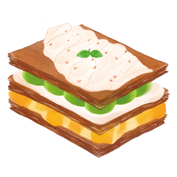
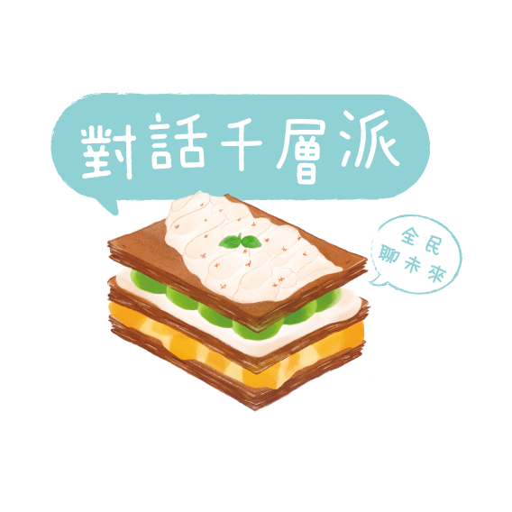
Mille-Feuille represents the island we inhabit, with its various layers symbolising different ethnic groups and individuals. Despite our differences, we all call this place home. To reinforce the Taiwanese identity, the upper layer of cream is shaped into the outline of Taiwan.
品牌簡介
【對話千層派】推廣「溫和共好對話」,帶動更多人持之以恆地在日常生活中,交換彼此對公共議題的資訊與想法,促進台灣人對公共事務的關注與參與,努力讓台灣往共好社會的方向前進。
設計理念
千層派彷彿就是我們所居住的島嶼,上面的各種成份餡料是不同的族群與人,但同樣的是我們都稱這個地方為家。為加強臺灣意象,而將上層的奶油繪製成了臺灣的形狀。
Symbol in Layers
Inspired by Taiwan's rich and diverse cultural influences and historical background, each layer represents a symbol: mango custard symbolises the Netherlands, mint leaves represent Spain, matcha custard embodies Japan, osmanthus cream symbolises the Ming, Qing, and the era of Nationalist government, and mochi represents the indigenous people, who have the longest history of inhabiting this land.
Taiwan's society is akin to a mille-feuille, with its abundance of cultural layers and contexts. Just like the layers of a mille-feuille intertwine, Taiwan's society nurtures different perspectives and blends them harmoniously, resulting in a unique Taiwanese flavor. This design aims to celebrate Taiwan's multiculturalism, history, and the harmonious coexistence of various cultural elements within its society."
各層次的象徵
靈感來自於台灣豐富多元的文化影響和歷史背景。每一層代表著一個象徵:荷蘭的芒果卡士達、西班牙的薄荷葉、日本的抹茶卡士達、明清及國民政府的桂花奶油,以及象徵住在這塊土地最久的原住民族群 -- 麻糬。
台灣的社會就像一塊千層派,擁有豐富的文化層次和脈絡。就像千層派的餡料層層交織,台灣社會孕育著不同的觀點,融合出獨特的台灣風味。這個設計旨在歌頌台灣的多元文化、歷史,以及各種文化元素在社會中的和諧共存。

Character Concept and Design
Continuing the design concept of the logo, I conceived and developed four characters closely related to Taiwan. I engaged in extensive discussions with the illustrator, Scrubby, and together, we brought these characters to life. The four characters are:
角色設定與設計
延續LOGO的設計理念,我構思並設定了四個與臺灣息息相關的角色。我與插畫家刷比進行了深入的討論,並透過刷比的詮釋來完成角色的繪製。這四個角色分別是:
From left to right: 茶先生 (ちゃせんせい / Cha-sensei) - academia; 大圓 (Tuā-înn) - youth, Mr. Jose (何西) - explorer; 桂姥姥 (Guì Lǎo Lao) - elder.
Social Media Templates
To facilitate future use on social media platforms, we have designed post templates that are user-friendly for content editors.
社群媒體模版
為方便日後在社群媒體上的應用,設計了對內容編輯者友善的貼文用圖模版。
