Mockup Image by rawpixel.com
Cofacts - Double-sided Brochure Design
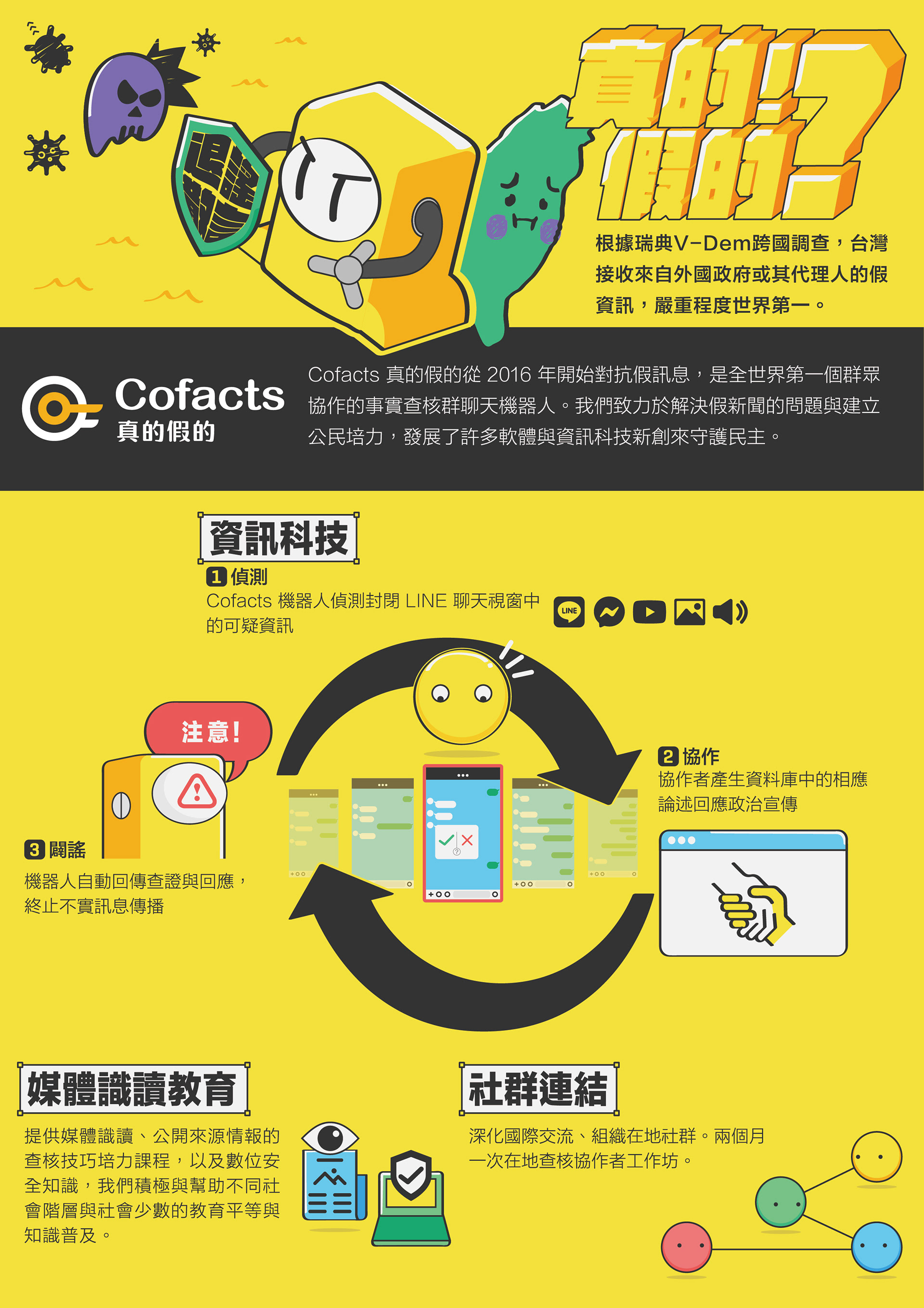
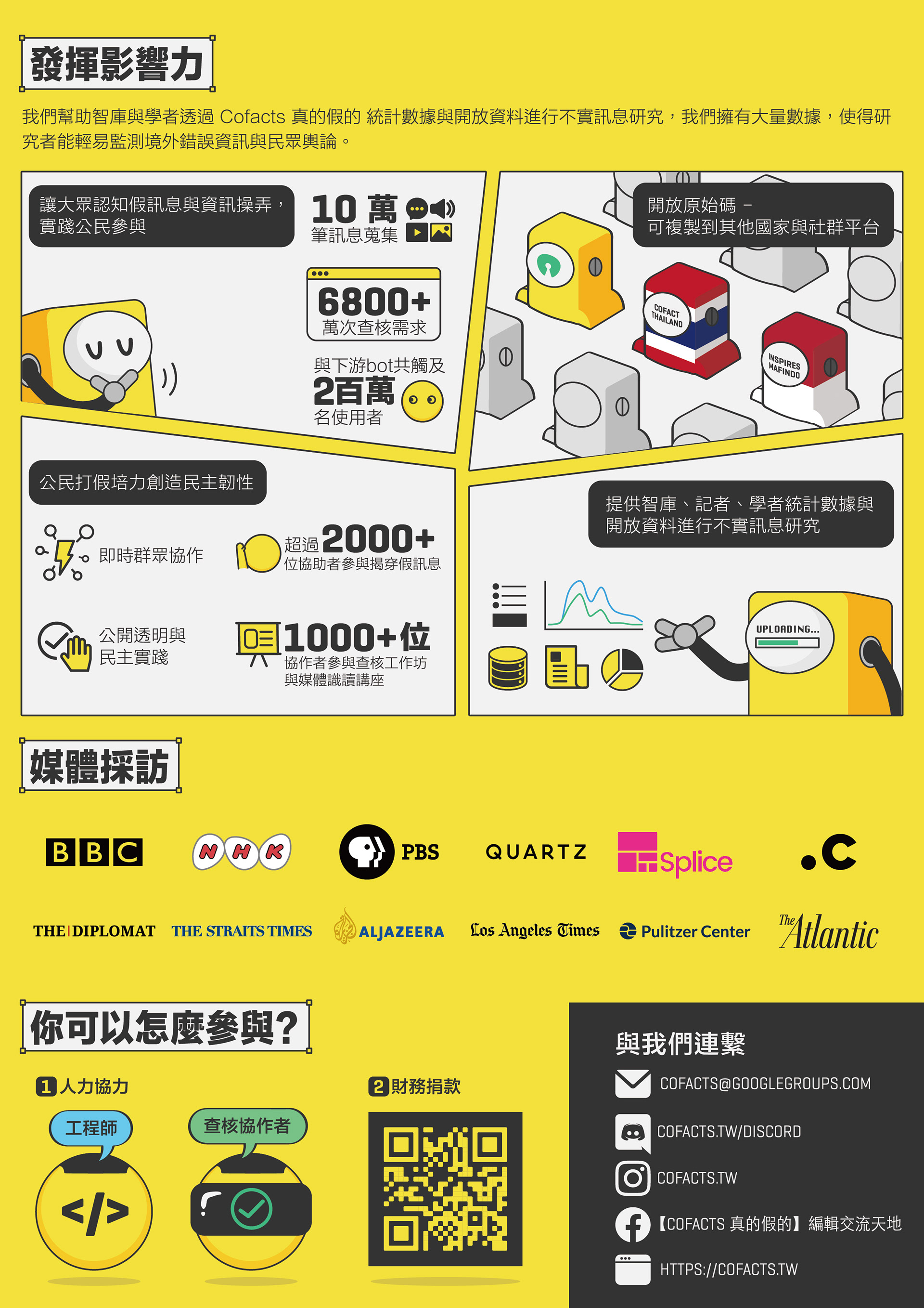
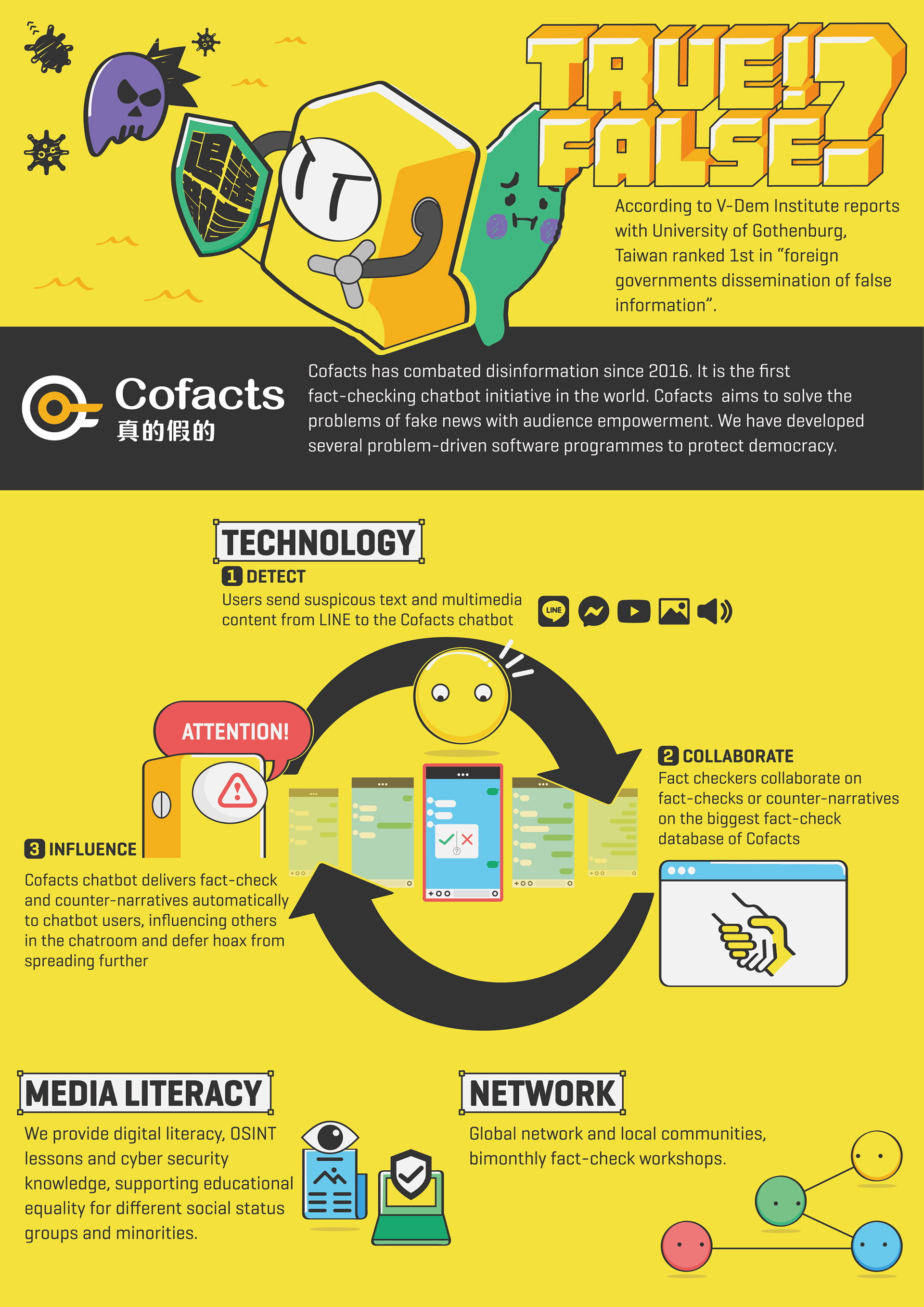
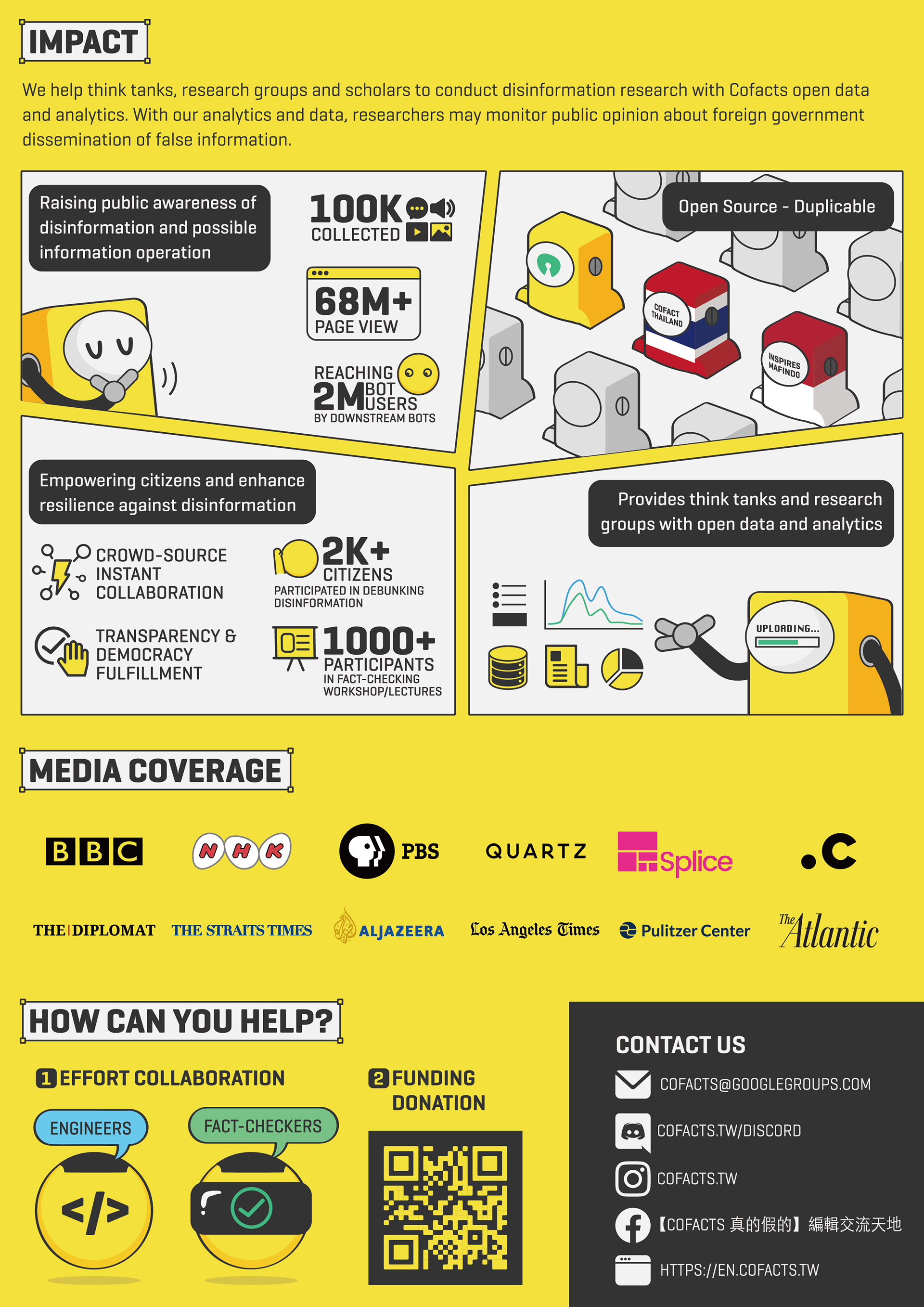
This A4 brochure aims to introduce what Cofacts is to the readers. The design considerations include:
- Collaborating with the client to carefully curate the content, ensuring a smooth reading experience.
- Incorporating Cofacts' brand colors to maintain brand consistency and enhance visual appeal.
- Utilizing the robot character from previous collaborations to create a more engaging and lively infographic design.
- Delivering the brochure in bilingual versions to cater to different needs and ensure broader usability.
By implementing these strategies, the brochure is designed to attract readers, effectively convey the purpose and services of Cofacts, and leave a lasting impression.
Cofacts真的假的 - 雙面文宣設計
這份A4文宣旨在向讀者介紹Cofacts真的假的是什麼。設計上的考量包括:
- 與客戶討論,精心選編內容,使閱讀脈絡在使用上更加流暢。
- 沿用Cofacts的品牌色彩,保持品牌識別性並提升視覺吸引力。
- 沿用先前的合作的機器人角色,使資訊圖表設計更加生動有趣。
- 提供雙語版本,以滿足不同用途的需求,並確保更廣泛的使用範圍。
- 沿用Cofacts的品牌色彩,保持品牌識別性並提升視覺吸引力。
- 沿用先前的合作的機器人角色,使資訊圖表設計更加生動有趣。
- 提供雙語版本,以滿足不同用途的需求,並確保更廣泛的使用範圍。
透過這些策略促使文宣吸引讀者,有效達成其目的並留下深刻印象。
